
The Ultimate Guide to Scalable Design Systems in 2026
Jan 24, 2026
James Rhodes

Hi, I'm James
I help startups turn confusing websites into conversion-ready ones in under 30 days.
100+ projects delivered
Worked with funded startups
Framer + UX specialist

7-Minute Website Fix Guide
Instant, high-impact fixes to improve clarity, trust, and conversions on your website.
View Our Services
Fast, high-quality Framer builds or Product Design to help startups ship and scale confidently.
Design Resources
Premium components, frameworks, and overrides for faster, better builds.
Master scalable design systems with expert strategies, AI insights, and proven frameworks for 2026. Build lasting, adaptable systems that drive team success.
Most teams adopt design systems to bring order, yet chaos often grows as products scale and evolve. The promise of clarity is quickly replaced by component overload, inconsistent UIs, and abandoned libraries.
This guide cuts through the noise. We reveal the core principles, psychological insights, and process-driven strategies behind scalable design systems that thrive in 2026’s high-velocity digital world.
You’ll learn why so many systems fail, how to architect strong foundations, steps for sustainable scaling, and where AI accelerates—never replaces—creative workflows. If you want to achieve clarity over noise and build systems that last, you’re in the right place.
Ready to rethink design at scale? Embark Studio™ is forging the future of scalable design systems—join us on the journey.
Why Most Design Systems Fail—and the Hidden Cost of Chaos
Most teams set out to build scalable design systems with the best intentions: reduce chaos, increase speed, and unify the brand. Yet, as products grow and teams multiply, what begins as a promise of order often transforms into a source of confusion. Why do so many design systems collapse under their own weight?

The Illusion of Control: Why Complexity Creeps In
The first trap is the illusion of control. Teams eager to future-proof their products often catalog every possible component, interaction, and state. What starts as a handful of essentials quickly spirals into hundreds of variants, creating a “component explosion.” Each addition promises flexibility, but ends up making navigation a nightmare. The more you try to anticipate every scenario, the more brittle and overwhelming your scalable design systems become.
Consider the “perfect system” syndrome. Months are spent designing for every edge case, only to launch a library already out of sync with real product needs. Instead of empowering teams, the system becomes a bottleneck. New features get delayed as designers and engineers sift through bloated documentation and outdated assets. The result? The very chaos you aimed to solve returns, now hidden inside a mountain of unused components.
Ownership and governance are often afterthoughts. Without clear roles and processes, maintenance falls by the wayside. Components drift out of sync, documentation grows stale, and the system quickly loses credibility. Teams revert to building one-off solutions, duplicating effort and diluting the brand. When scalable design systems lack a living process, abandonment is inevitable.
Let’s ground this in reality. A major fintech startup invested heavily in their design system, expecting it to streamline development. But with no process for feedback, no shared ownership, and a library built in isolation, adoption lagged. After just eight months, the system was quietly shelved. The cost? Inconsistent UI, wasted resources, and delayed launches.
The data is stark: up to 70% of design systems fail within their first year, leading to duplicated work and lost momentum. This hidden cost of chaos is rarely tracked, but it erodes trust and slows every release. Teams spend more time reconciling inconsistencies than building new value. The promise of scalable design systems fades fast without a foundation of process and collaboration.
So, what’s the real insight? Sustainable systems focus on process, not just products. Instead of chasing every possible component, start by solving your team’s top pain points and iterating from there. Embed ownership, feedback loops, and real-world usage into the core of your system. For a deeper dive into these foundational principles, check out the essential guide to systems in design.
Studio thinking: Systems outlast screens. Clarity, rhythm, and a process-driven approach are the true drivers of scale. If you’re ready to move beyond chaos, start building your framework—not just your library—with Embark Studio™ in mind.
Foundations for Scale: Building Blocks That Endure
When teams first embrace scalable design systems, they often think more features equal more value. In reality, piling on components and colors only multiplies chaos. The real secret? Lasting systems start small, solve real problems, and grow with intention.

The Psychology and Architecture of Lasting Design Systems
The foundation of scalable design systems is not technical—it’s psychological. Start by identifying the top three pain points your teams face. Is inconsistent button styling slowing you down? Are handoffs between design and development a source of friction? Is brand drift creeping in as new features launch? Facing these issues head-on gives your system purpose.
Instead of chasing the mythical “perfect” foundation, focus on a Minimum Viable System (MVS). This approach is the antidote to over-engineering and complexity. Here’s how to structure your MVS for scalable design systems:
Foundation Element | Best Practice Example |
|---|---|
Color Palette | 8–12 accessible, semantic colors |
Typography Scale | Modular scale (base 16px, ratio 1.25x) |
Spacing System | 8px grid for rhythm and consistency |
Core Components | 3–5 essentials: Button, Input, Card, Nav |
Semantic color systems are essential. Use names like action-primary instead of blue-500. This makes your system resilient to brand evolution and accessible for everyone. For a deeper dive into how color psychology shapes perception and usability, check The psychology of color in web design.
Apply a modular scale to typography: pick a base size, set a ratio, and let the rhythm guide your hierarchy. An 8px grid brings order, making layouts predictable and flexible across products. These principles are the backbone of scalable design systems.
Let’s ground this in reality. A SaaS platform once tangled in design-developer debates cut friction by 40% after rolling out a semantic, token-based foundation. Suddenly, decisions were faster, handoffs smoother, and updates less risky.
AI can now accelerate these workflows. Imagine AI tools analyzing your product’s color usage or text hierarchy, then suggesting scalable design systems tailored to your needs. Still, human judgment is irreplaceable—only people can weigh accessibility, emotion, and brand intent.
Studio thinking means systems outlast screens. When you build for clarity and rhythm, your design system becomes more than a product—it’s a living toolkit that adapts as you grow. If you’re ready to architect foundations that endure, explore more of the Embark Studio™ framework for scalable design systems.
The Scalable Component Strategy: Quality Over Quantity
Most teams believe that scalable design systems require hundreds of components. In reality, more components often create clutter, confusion, and slowdowns. The true challenge is not building everything, but building only what matters—and evolving it with precision.

Auditing, Prioritizing, and Evolving Your Component Library
Start with a reality check: screenshot every unique UI element in your product. Group them by function and frequency. This audit exposes where duplication and inconsistency hide, revealing the actual landscape of your design system.
Next, prioritize. Not all components are created equal in scalable design systems. Focus your energy on the highest-impact, most-used elements—think buttons, inputs, navigation, and cards. Ignore rare edge cases at first. This approach is echoed in best practices to scale design with design systems, where governance and focused roles drive sustainable growth.
Apply a simple, repeatable process:
List every component in a table.
Rank by usage across your product.
Select the top five for initial systemization.
Netflix’s design system matured by tracking real usage analytics, evolving only the components teams actually used. The result: less noise, more clarity, and faster iteration. When you build scalable design systems this way, you avoid bloated libraries and ensure relevance.
The Component Maturity Model: Progress from basic (visual only) to mature (documented, tested, analytics-enabled) components
Think of every component as evolving through clear stages. Start basic: a visual spec and a simple implementation. Next, add documentation, accessibility checks, and usage guidance. Mature components include automated tests, analytics, and clear migration paths.
Here’s a quick reference table:
Stage | Description |
|---|---|
Basic | Visual style, static implementation |
Documented | Usage, props, accessibility notes |
Tested | Automated visual and functional tests |
Analytics | Usage data, impact tracking |
Atomic design principles help structure scalable design systems. Use tokens (color-primary, spacing-md) as the foundation. Build elements (like Button, Input) on these tokens, then assemble components (such as Card, Navbar). Patterns emerge when you combine components into real flows.
Maintain parent-child logic. If you update a parent (like a Card), changes cascade to children (Image, Text, Button). Never ship a component without concise documentation—a quick reference, an implementation guide, and deep-dive details.
AI can accelerate this workflow by automating regression testing and suggesting documentation updates. But remember, creative decisions and system clarity are deeply human. Studio thinking means always favoring clarity and rhythm over quantity—systems, not screens, drive sustainable scale.
Curious how this process could transform your own design workflow? Stay tuned for deeper dives into Embark Studio™ frameworks that put scalable design systems at the core.
Process-Driven Governance: Keeping Your System Alive
Design systems often launch with fanfare, only to wither in the shadows of neglect. Why? The answer is simple: without a living, breathing governance process, even the most promising scalable design systems become obsolete. The misconception is that a one-time setup will suffice. In reality, sustaining momentum demands continuous collaboration, clear roles, and data-driven iteration.
Ownership, RFCs, and Measuring What Matters
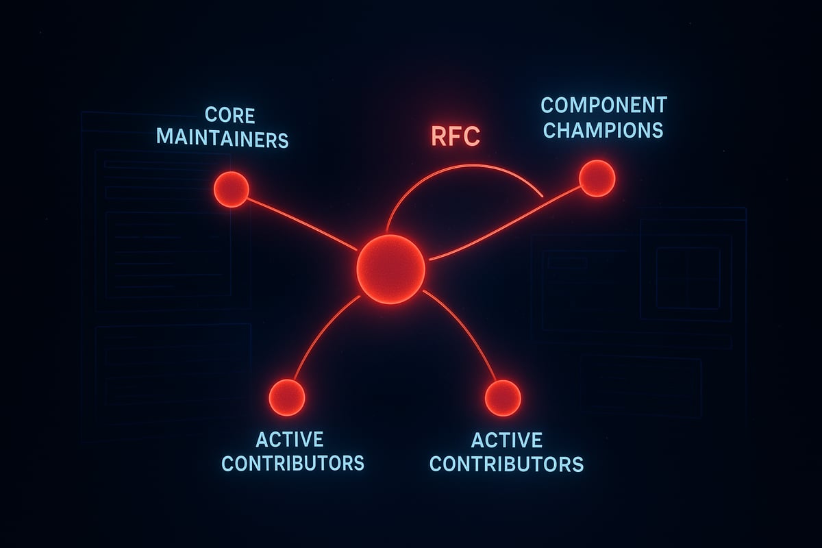
The backbone of scalable design systems is clear ownership. The hub and spoke model brings order to the chaos. Imagine a central hub of maintainers who drive strategy, while spokes—component champions—gather feedback from the broader community. This structure ensures no single person becomes a bottleneck, and the system remains responsive to real needs.
The RFC process is the engine that powers this model:
Propose: Anyone can draft a proposal for a new component, update, or workflow.
Discuss: Open, time-boxed discussions invite feedback and uncover edge cases.
Decide: Core maintainers make the final call, balancing vision with team input.
Implement: Changes roll out with clear documentation and migration guidance.
Communicate: Updates are shared widely, closing the loop.
Measurement is non-negotiable. Track adoption metrics like percentage of product UIs using system components. Quality metrics—consistency, accessibility, and user ratings—reveal the impact of your scalable design systems. Community metrics, such as contributor activity and training engagement, signal the system’s health. For a deep dive into sustainable growth and continuous improvement, see Product design and innovation strategies.
Uber’s global design system thrived by embedding system work into product teams and running regular RFC cycles. This approach built trust, kept assets relevant, and inspired more contributions.
Studio thinking: Governance is a living process, not a static rulebook
The psychology of scalable design systems is rhythm—governance must evolve as the digital landscape shifts. Static rulebooks breed resentment and outdated assets. Instead, embrace studio thinking: treat your system as a living product.
Set regular intervals for reviewing metrics, inviting feedback, and celebrating wins. Rotate maintainers to infuse fresh perspective. Use AI to automate repetitive reporting, but let humans interpret the data and steer creative direction. This living governance model doesn’t just keep the lights on—it sparks innovation.
Remember, in scalable design systems, clarity always beats complexity. Treat governance as your creative engine, not a bureaucratic hurdle. Looking for a proven framework? Our Embark Studio™ system is built on these very principles—designed for teams who want their design system to thrive, not just survive.
Avoiding Common Pitfalls on the Path to Scale
Scaling a design system is rarely a straight line. The biggest threat is not a lack of ambition, but falling into familiar traps that quietly unravel clarity and momentum.
When teams chase the ideal of scalable design systems, they often end up with bloated libraries, fragmented processes, and documentation no one reads. The result? Adoption stalls, and chaos quietly returns.
Real-World Traps and Proven Solutions
What derails scalable design systems most often? The answer is rarely technical. It is psychological—teams overcomplicate, isolate, and aim for perfection.
Building in Isolation
Perfect System Syndrome
Overly Complex Components
Documentation Debt
Neglecting Migration Paths
A leading e-commerce brand faced all these pitfalls. By prioritizing just-in-time documentation and gradual migration, they cut onboarding time in half, and design-developer friction dropped sharply.
The risks are real: up to 70% of design systems fail within the first year. Sustainable, scalable design systems demand process, not just product.
Pitfall | Solution |
|---|---|
Isolation | Embed system in product teams |
Perfectionism | Launch, then iterate |
Complexity | Keep components composable and simple |
Documentation debt | Ship docs with every component |
Migration neglect | Guide and schedule every update |
AI, Studio Thinking, and Next Steps
AI is changing how teams approach scalable design systems. AI can surface documentation gaps, automate migration checklists, and flag inconsistencies before they spread. Still, judgment, clarity, and brand alignment remain human territory.
The studio mindset anchors every decision in clarity, rhythm, and process. Systems outlast screens. For teams aiming to master scalable design systems, focus on iterative improvement, not unattainable perfection.
Curious about frameworks that keep scaling smooth? Watch for Embark Studio™'s evolving toolkit—built for the future of design systems.
Technology and Tooling for Sustainable Design Systems in 2026
Most teams believe the right tool alone will bring order, but the reality is more complex. As products and teams scale, the wrong choice in technology or process can quickly turn scalable design systems into tangled webs of inconsistency and technical debt. The real challenge is not picking the latest platform, but building a process where clarity outpaces chaos.
True sustainability starts with tool-agnostic principles. Every scalable design system needs a single source of truth—shared, version-controlled, and accessible across both design and code. Usage tracking is essential, not just for analytics, but for real-time insight into how components are actually used. This approach ensures that your system evolves with your product, not against it. If you want to stay ahead of the curve, examine "The future of enterprise design systems: 2026 trends and tools for success" for emerging best practices in the field.
The bedrock of modern scalable design systems is the design token. Think of tokens as the atomic DNA of your product’s look and feel: color, typography, spacing, sizing, and animation. Consistent, semantic naming conventions like color-action-primary-hover bring clarity and prevent confusion as the system grows. Automated component generators now sync design and code, reducing manual errors and making sure updates ripple through interfaces predictably. A simple, well-structured token table can look like this:
Token Category | Example Name | Value |
|---|---|---|
Color | color-action-primary | #FF0000 |
Typography | font-size-heading-large | 32px |
Spacing | spacing-stack-md | 24px |
Living documentation is no longer a nice-to-have—it is a non-negotiable. Modern systems connect documentation directly to design tools and codebases, so every change is reflected instantly. AI-accelerated workflows are revolutionizing this process. AI can generate new tokens, automate documentation updates, and flag inconsistencies in real time. For example, a B2B SaaS startup recently cut maintenance time by 30 percent using AI-powered design token management. For a deeper dive into AI’s role in workflow acceleration, see AI website design in 2025. Still, creativity, judgment, and brand alignment remain fundamentally human.
Studio thinking is clear: systems outlast screens. The future of scalable design systems lies in clarity, rhythm, and extensibility, not in chasing the latest feature or fad. Focus on principles that scale, and your design system will grow stronger with every iteration.
Ready to shape the next evolution? Stay tuned for more from the Embark Studio™ system—crafted for clarity, built to last.
You’ve seen how the right design system can transform chaos into clarity, but you don’t have to tackle the journey alone. If you want your startup’s product experience to scale seamlessly—without endless handoffs or wasted effort—we’re here to help you put these principles into action. Let’s chat about your unique challenges and explore how a process driven, conversion focused approach can accelerate your growth. Book a call with our team and discover what a truly scalable design system could do for you.

Blog / Newsletter