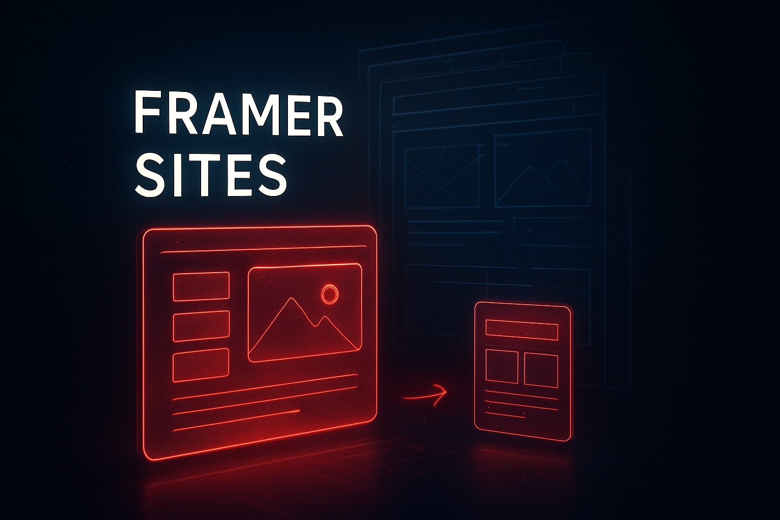
10 Stunning Framer Sites to Inspire Your Next Project 2026
Jan 26, 2026
James Rhodes

Hi, I'm James
I help startups turn confusing websites into conversion-ready ones in under 30 days.
100+ projects delivered
Worked with funded startups
Framer + UX specialist

7-Minute Website Fix Guide
Instant, high-impact fixes to improve clarity, trust, and conversions on your website.
View Our Services
Fast, high-quality Framer builds or Product Design to help startups ship and scale confidently.
Design Resources
Premium components, frameworks, and overrides for faster, better builds.
Discover 10 stunning Framer sites that showcase cinematic design, AI workflows, and proven systems to inspire your next project and boost your web impact.
Many digital creators still think that building visually stunning websites means wrestling with complex code or waiting for slow agency timelines. The truth is, framer sites are redefining what's possible in modern web design, making it easier for teams to launch cinematic, high-converting pages with speed and clarity.
In this article, you'll discover 10 framer sites that prove clarity, rhythm, and psychology drive real results. From SaaS products to portfolios, agencies, and e-commerce, these examples reveal how thoughtful design systems outperform visual noise.
Get ready to see how visual storytelling, real UI decisions, and modern workflows can transform your next project. Explore proven frameworks and inspire your journey toward high-performance digital experiences.
Why Framer Sites Are Winning in 2026
Modern web design is evolving fast. Many still believe that building stunning, effective websites means wrestling with code or relying on slow, traditional workflows. The reality is, framer sites are redefining the landscape in 2026. They stand out for their clarity, rhythm, and depth, which directly influence user engagement and conversions.
The Psychology of Modern Web Design
Why do framer sites excel? The secret is in their design psychology. Clarity and rhythm guide users, making information easy to scan and absorb. Depth and hierarchy capture attention, using whitespace and motion to lead the eye. Storytelling turns every scroll into a journey, not just a transaction.
For example, sites built in Framer often highlight bold headlines, clean layouts, and subtle animations. These choices build trust and keep visitors engaged. Micro-interactions, like smooth button feedback, create delight and reinforce credibility. Studies show that simplified, focused layouts can boost conversions by up to 27 percent.
Want to dive deeper? Explore these Framer site design fundamentals to see how these principles work in practice.
The AI-Accelerated Workflow
AI now powers the fastest framer sites workflows. Designers use AI to brainstorm layouts, generate custom copy, and create image variations in seconds. This acceleration means more time to focus on creative thinking and storytelling.
AI is a tool, not a replacement. It speeds up iteration, but the most successful framer sites are shaped by human insight. For example, a studio might use AI to generate multiple hero sections, then refine the best one for clarity and emotional impact. The result is a smarter, faster process that never loses the human touch.
Systems Over Screens: Designing for Scale
Scaling framer sites means thinking in systems, not just screens. Instead of crafting one-off pages, designers build reusable components—navigation bars, content cards, call-to-action blocks. This approach creates visual consistency and speeds up launches.
Framer’s component architecture is built for this mindset. Teams can update a single component and see changes ripple across the entire site. It is a method that supports growth and keeps design fresh, even as content evolves. Studios now prioritize flows and patterns, ensuring every user journey feels intentional and seamless.
Soft CTA: Explore Proven Frameworks
The best framer sites are powered by robust design systems and toolkits. These frameworks make it easy to launch high-performance experiences, adapt quickly, and keep every detail consistent. If you are looking to elevate your next project, consider proven approaches that prioritize clarity, rhythm, and long-term scalability.
At Embark Studio™, we believe in building digital experiences that grow with you. Our toolkit is designed to help you harness the full potential of modern framer sites.
10 Stunning Framer Sites to Inspire Your Next Project
What does it take for framer sites to truly stand out in 2026? The answer is a blend of clarity, rhythm, and strategic storytelling, seen in real, conversion-focused UI. Let’s break down ten examples that redefine what’s possible with framer sites, showing the psychology behind every pixel and the systems thinking that powers scalable design.
Blok
Blok is a standout among framer sites for tackling digital distractions head-on. Its model combines app-blocking hardware with seamless UX, creating a focused digital environment. Users get routines that enhance productivity and tangible behavior change.
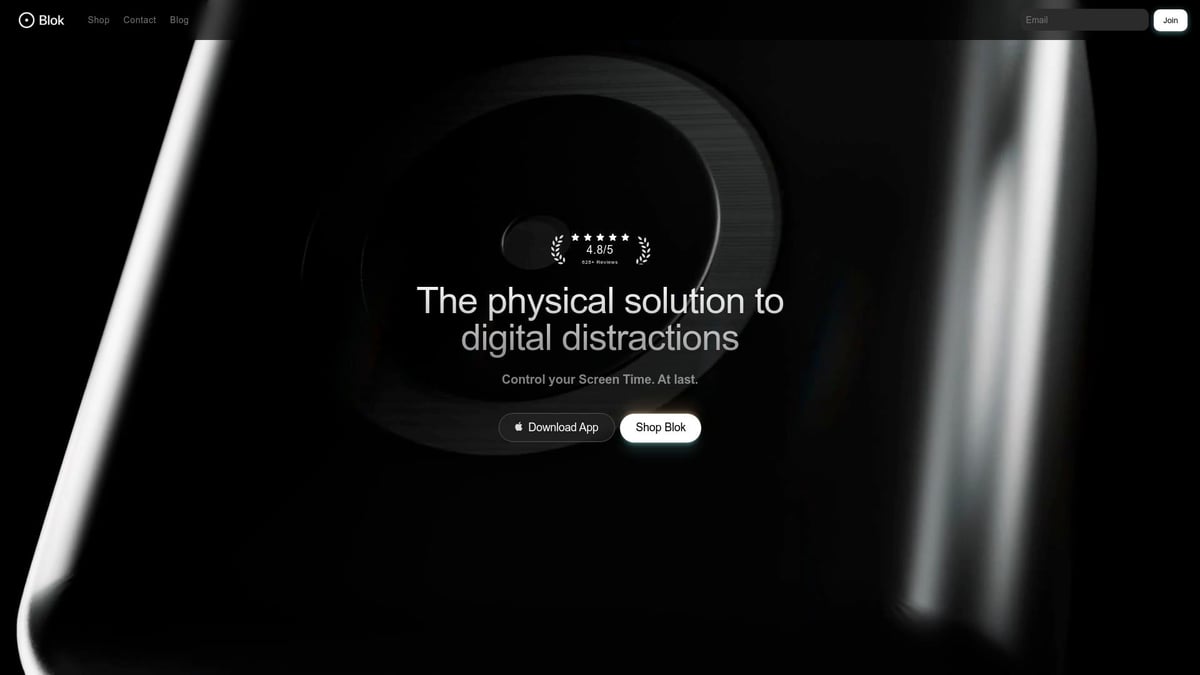
Pricing follows a device and subscription model, making it accessible for productivity seekers, students, and remote teams. The unique hardware-software blend delivers instant results, though needing a physical device may not fit every workflow.
The UI is clean, uses bold typography, and guides users with clear calls-to-action. Whitespace and motion keep the experience direct and compelling. If you want framer sites that drive action with clarity, Blok is a masterclass.
Wilkinson & Rivera
Wilkinson & Rivera crafts high-end, custom furniture, and their site is a visual journey. This framer sites example fuses modern and classic design, highlighting sustainable materials and artisan storytelling.
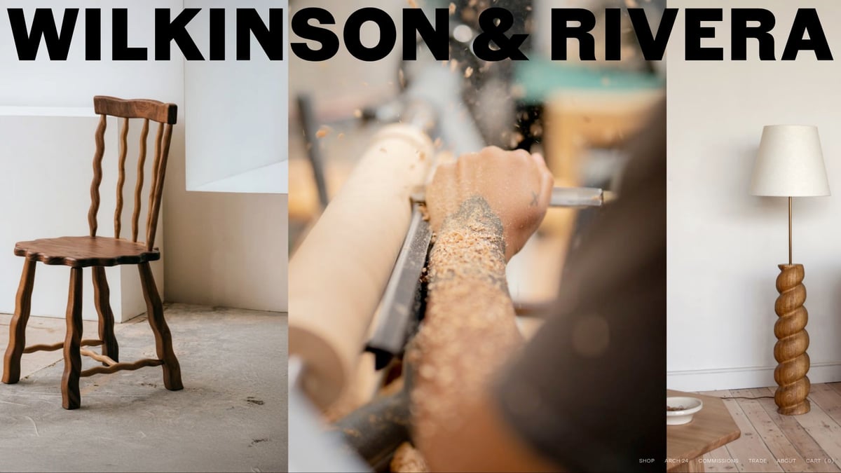
Pricing is bespoke, reflecting the luxury market. Design-conscious buyers and interior designers are the core audience. Cinematic visuals and immersive scroll experiences elevate brand trust, though the niche focus and premium price may limit appeal.
Editorial-style layouts and rhythmic content flow create an emotional connection. This site proves framer sites can blend editorial elegance with conversion-driven clarity.
Yuna
Yuna brings AI-personalized children’s stories to life, making it a playful entry among framer sites. The freemium app model, interactive games, and seamless onboarding engage both children and parents.
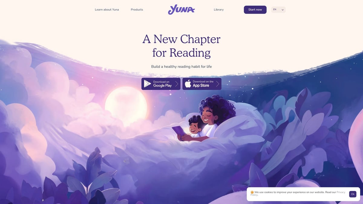
The target audience includes educators and families with kids aged 1 to 12. The playful UI, animated interface, and clear navigation make learning fun. However, its focus is limited to story-based learning.
Yuna’s colorful, motion-rich design shows how framer sites can support learning journeys while keeping the experience joyful and intuitive.
TRIFECTA
TRIFECTA is a creative studio specializing in branding, content, and paid social for tech and luxury brands. As one of the most visually bold framer sites, it features cinematic hero videos and a layered grid system.
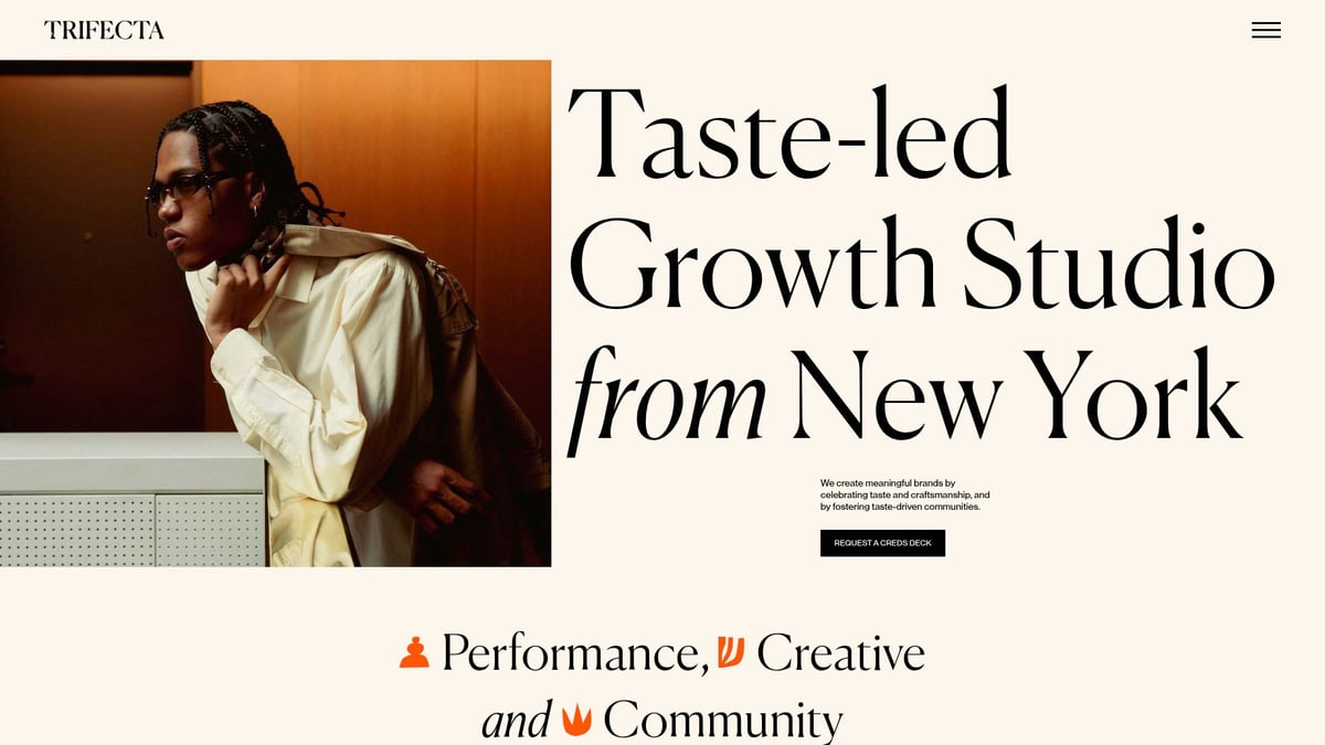
Pricing is custom, targeting startups and high-end hospitality. The studio’s storytelling focus drives growth, but the high-touch service is not self-serve.
The modular grid and content blocks illustrate how framer sites can scale through systems thinking. For more inspiration, check out Inspiring Framer agency portfolios to see more agency-driven approaches.
Genius Distro
Genius Distro empowers independent musicians with a robust, end-to-end music distribution platform. This example of framer sites excels in clarity, offering royalty management and marketing tools.
Distribution fees are transparent, and the platform supports major streaming services. The competitive space is a challenge, but dynamic content and dark mode UI help Genius Distro stand out.
Clear value propositions and dynamic content make navigation easy. Framer sites like this show how focused layouts and strong hierarchy boost user confidence.
Webveda by ankur warikoo
Webveda is built for entrepreneurs and professionals seeking personal growth through video courses. The site uses framer sites’ modularity to deliver engaging content and a seamless learning journey.
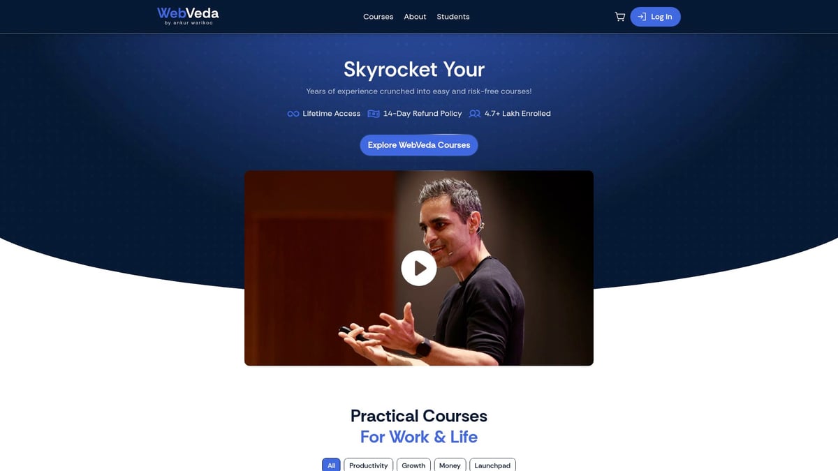
Pricing is clear and course-based, but content is limited to Warikoo’s expertise. Sticky navigation and modular cards enhance the user experience.
Webveda’s structured layout and concise organization illustrate how framer sites can guide users through complex learning paths without friction.
Hodinkee Studio
Hodinkee Studio’s editorial approach makes it a niche favorite among framer sites. It offers in-depth watch reviews, blending modern and historic storytelling.
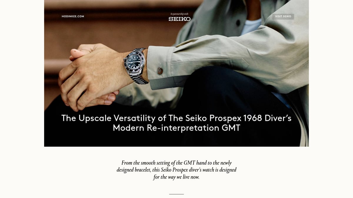
Editorial content is free, with product links for collectors. The focus is narrow, but rich media and layered storytelling build deep engagement.
Elegant serif typography, immersive imagery, and clear hierarchy create a cinematic reading experience. This proves framer sites excel when narrative and design are in perfect sync.
FEASTIE
FEASTIE is a vibrant showcase for food events, using framer sites to drive attendance and support local businesses. Event tickets and vendor pricing vary, targeting foodies and festival goers.
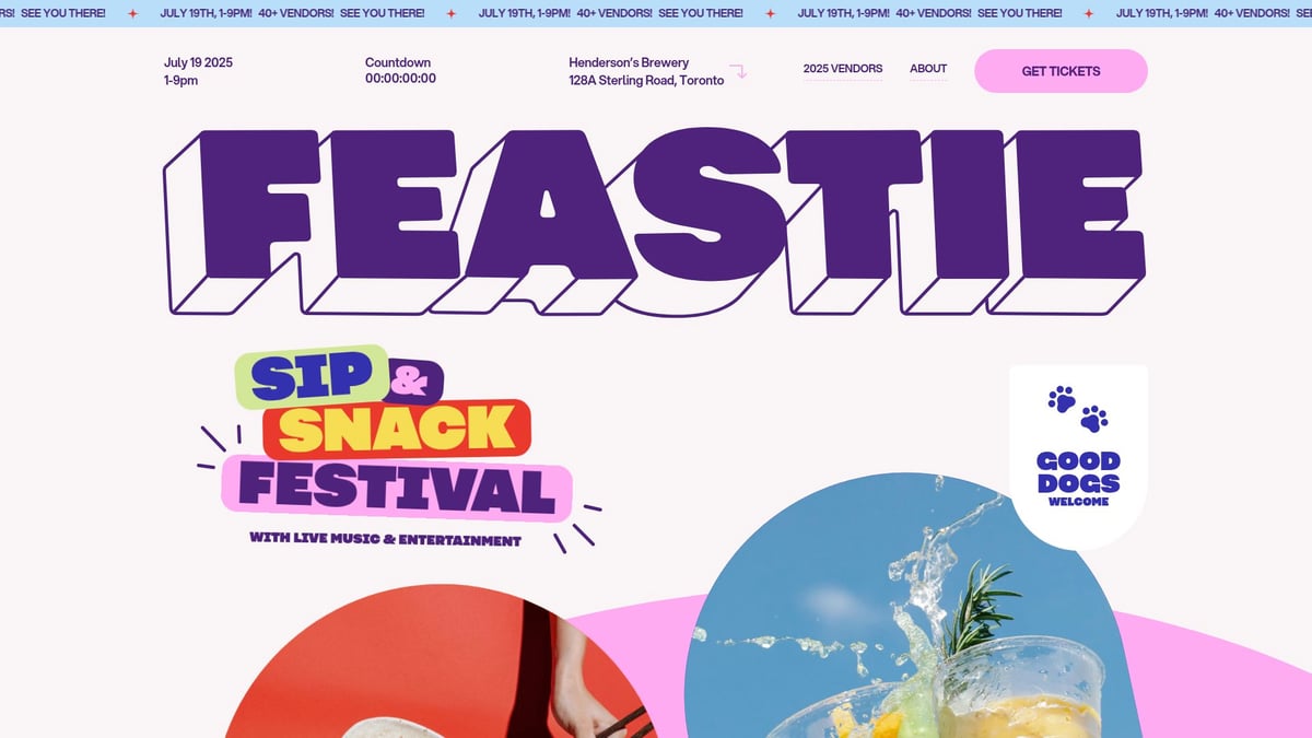
The retro color palette and rhythmic section transitions energize the site. Regional focus is a limitation, but clear event info and vendor highlights make the experience inviting.
FEASTIE demonstrates how framer sites can turn event pages into immersive, high-conversion journeys.
Unifiers of Japan
Unifiers of Japan transforms history into an interactive, narrative-driven experience. It’s a free educational resource, making it a unique addition to framer sites.
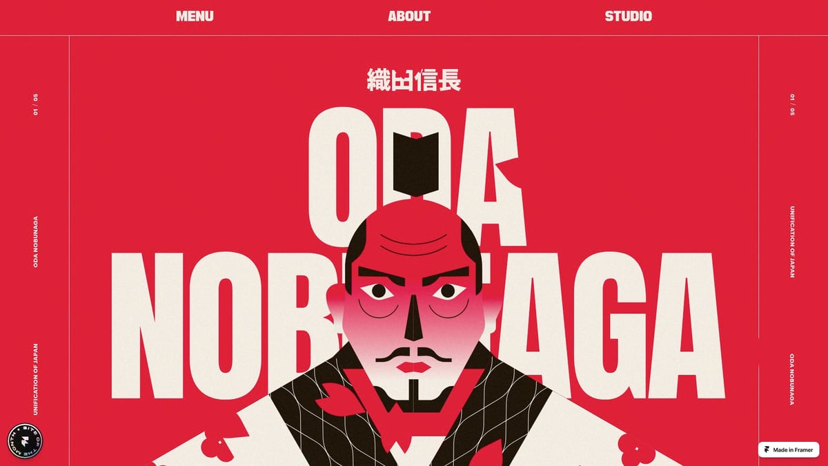
Scroll-triggered animations and timeline UI elements keep users engaged. While content is specific, the interactive approach supports both students and history enthusiasts.
This site showcases the power of framer sites to deliver complex information with depth and clarity, using motion and narrative as educational tools.
Embark Studio™
Embark Studio™ stands at the intersection of high-performance framer sites and continuous improvement. Memberships start at $4,000/month, targeting startups and innovation-driven brands.
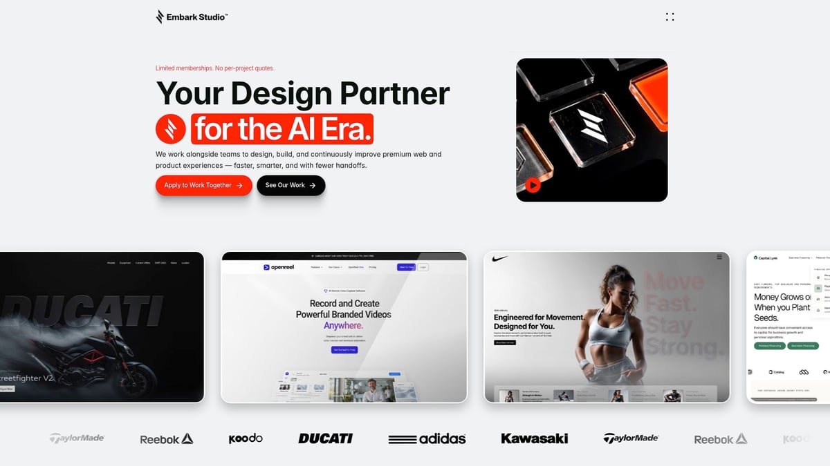
The benefits include embedded partnership, outcome-focused design, and instant onboarding. The membership model may not fit one-off projects, but the execution is always senior-level.
Conversion-focused layouts, motion-driven storytelling, and robust component systems set Embark Studio™ apart. This is where systems thinking meets cinematic design, offering a blueprint for scalable, modern framer sites.
How to Apply These Design Principles to Your Next Framer Project
The biggest myth in digital design? That only code-heavy workflows or expensive agencies deliver cinematic, conversion-driven results. But framer sites are proving otherwise. With the right approach, anyone can craft sites that feel high-end and perform. Here’s a process-driven blueprint to guide you.
Step 1: Start with a Clear Narrative
Every high-performing site begins with a story. Before pixels or components, ask: What journey should users take? Framer sites like Wilkinson & Rivera excel by structuring content around a rhythmic flow—each scroll reveals a new chapter, guiding attention through editorial-style layouts.
Clarity wins over clutter. Define your core message, use whitespace for breathing room, and let each section build anticipation. This approach creates depth and rhythm, key traits seen in the best framer sites.
Step 2: Focus on Systems, Not Just Screens
Designing for scale means thinking in patterns, not one-off pages. Build reusable components and templates. Framer sites such as TRIFECTA demonstrate this with modular grids and content blocks, enabling rapid updates and consistent experiences.
Component-driven workflows cut launch times and future-proof your site. Want to master this mindset? Explore Framer website builder strategies to see how systems thinking transforms framer sites from static to scalable.
Step 3: Leverage AI for Ideation, Not Automation
AI is your creative accelerator, not your replacement. Use it to quickly generate copy, imagery, or layout variations, but always refine outputs with human insight. Yuna’s personalized story content is a prime example—AI sparks ideas, but storytelling connects with users.
Studios use AI as a toolkit for rapid prototyping while preserving creative vision. For deeper insight, see AI's Role in Web Design and learn how framer sites blend AI with artistry.
Step 4: Design for Conversion and Credibility
Whitespace, hierarchy, and micro-interactions are not just trends—they direct action and build trust. Framer sites like Blok guide users with focused calls-to-action and clear product storytelling, reducing friction at every step.
Test layouts for clarity. Remove distractions. Every interaction should reinforce your credibility and prompt meaningful engagement. This is the psychology behind why framer sites outperform cluttered competitors.
Step 5: Iterate and Optimize Continuously
Great framer sites are never static. Gather real user feedback, analyze analytics, and evolve components as needs shift. Embark Studio’s continuous improvement model is proof—data-driven tweaks drive conversion and keep experiences fresh.
Think of your framer sites as living systems. The best results come from ongoing iteration, not one-time launches. Want a proven framework? Our design toolkit puts these principles into practice for scalable, cinematic outcomes.
The Future of Framer Sites: Trends to Watch in 2026
What does tomorrow hold for framer sites? Many still assume that web design is about chasing the latest visual trend, but the future is about clarity, rhythm, and authentic storytelling. Data and psychology reveal that users crave order and depth, not visual noise. As the digital landscape evolves, the most effective framer sites will be those that guide attention, foster trust, and inspire action.
In 2026, AI-assisted design systems are transforming how we build framer sites. Rather than replacing creativity, AI becomes a powerful accelerator. Imagine generating dozens of layout variations in seconds, or using AI to refine content for accessibility and inclusivity. Still, the designer's vision remains central. The best sites blend algorithmic efficiency with human insight, creating flows that feel cinematic and personal.
Motion design is no longer just decoration. It is a storytelling tool, adding rhythm and emotional depth to framer sites. Micro-interactions, layered transitions, and responsive feedback help users feel guided rather than overwhelmed. This approach aligns with the 2026 Graphic Design Trends, which emphasize tactile experiences and narrative clarity.
Membership-based design partnerships are also on the rise. Startups and product teams now seek ongoing, data-driven collaboration, not just static site launches. Analytics fuel continuous optimization, turning framer sites into living systems that adapt and improve over time. The shift is clear: systems and frameworks matter more than isolated screens.
Studio thinking leads the way. The future belongs to those who design for scale, clarity, and real outcomes. For a deeper dive into the experts shaping this era of framer sites, explore the Framer experts guide 2026. Your next project deserves a toolkit built for tomorrow.
If you’re feeling inspired by these Framer sites and ready to elevate your own digital experience, why not take the first step with a friendly chat? At Embark Studio™, we thrive on helping ambitious startups and creative teams build websites that don’t just look beautiful—they’re designed to convert, scale, and tell your story with clarity and rhythm. Whether you have a vision in mind or want to explore what’s possible with modern design systems and AI-assisted workflows, let’s connect and brainstorm together. Curious about how we could partner on your next project? Book a Free Discovery Call

Blog / Newsletter