
PlanBetter
Benefits for small and mid-sized teams, finally explained in plain language. We built the brand and the site that make a new platform feel trustworthy.
- Client
- PlanBetter
- Scope
- Brand identity, Website
- Year
- 2026
- Stack
- Next.js
The mark is
a puzzle piece.
We help you put
the picture together.
Every photo is seen through the mark, so the promise shows up everywhere.
At renewal, small employers get the least attention and the fewest choices.
PlanBetter needed to feel calm and human, and a pilot list employers want to join.
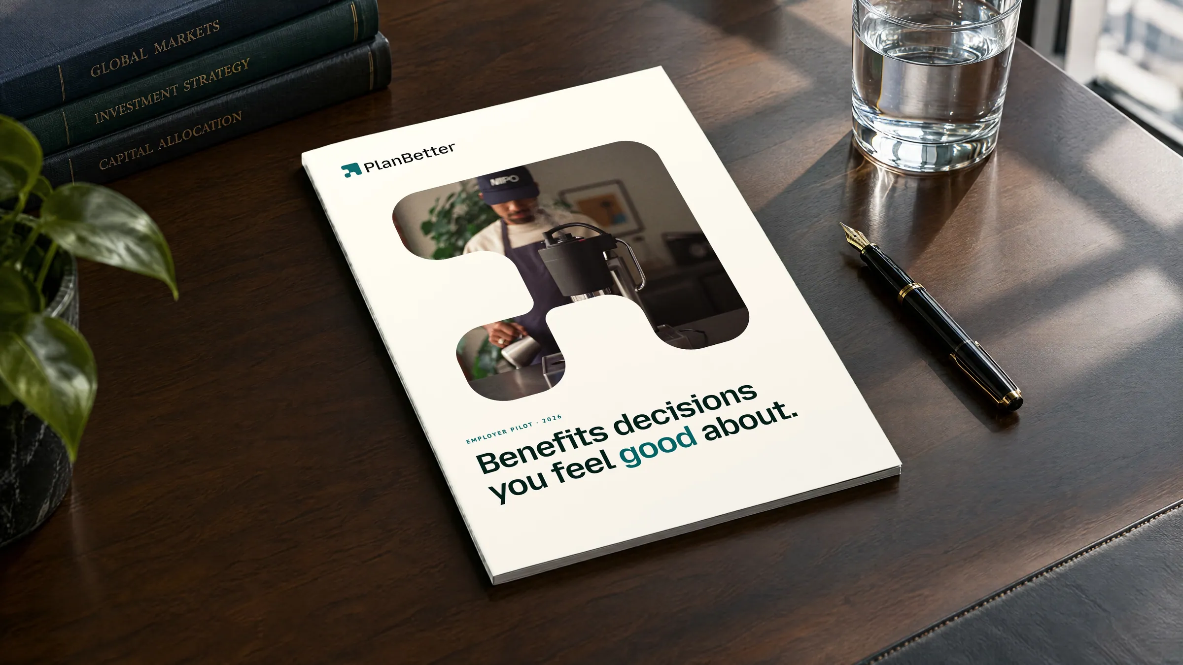
Brand
A mark, three colours and two typefaces that make a hard decision feel lighter.

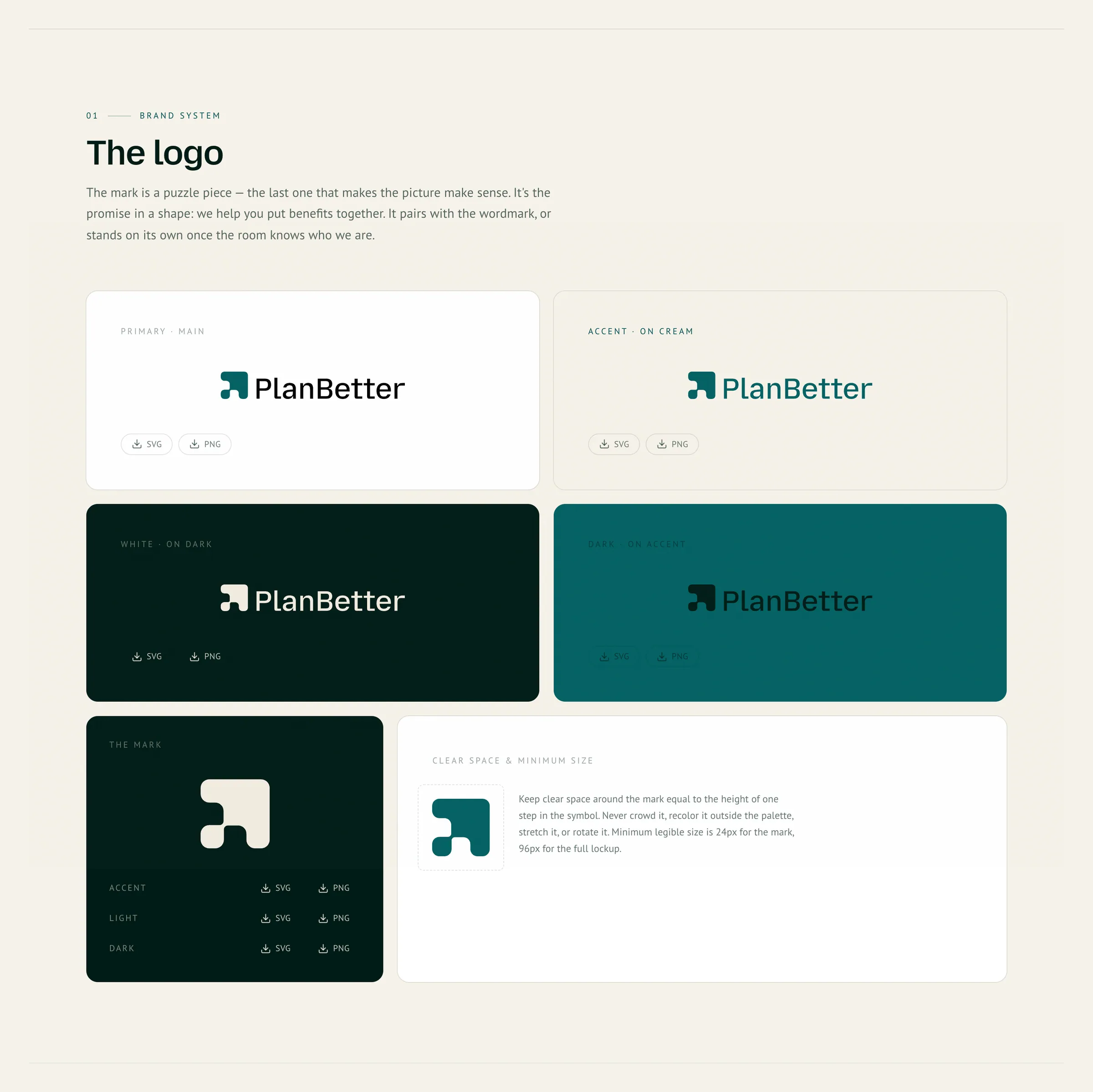
One mark,
recognisable on any ground.
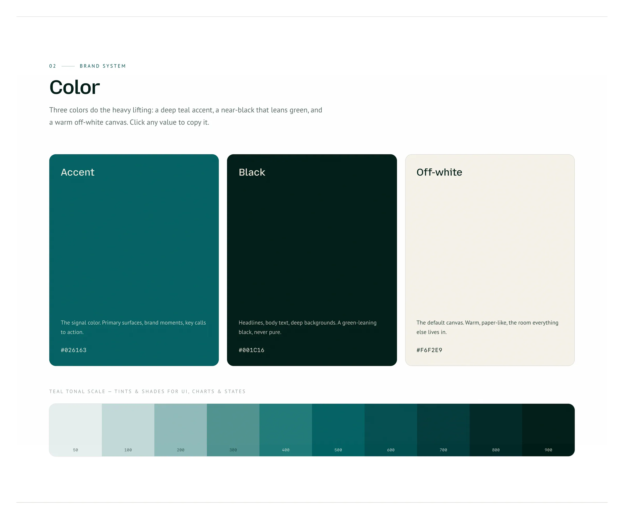
Three colours,
instantly PlanBetter.
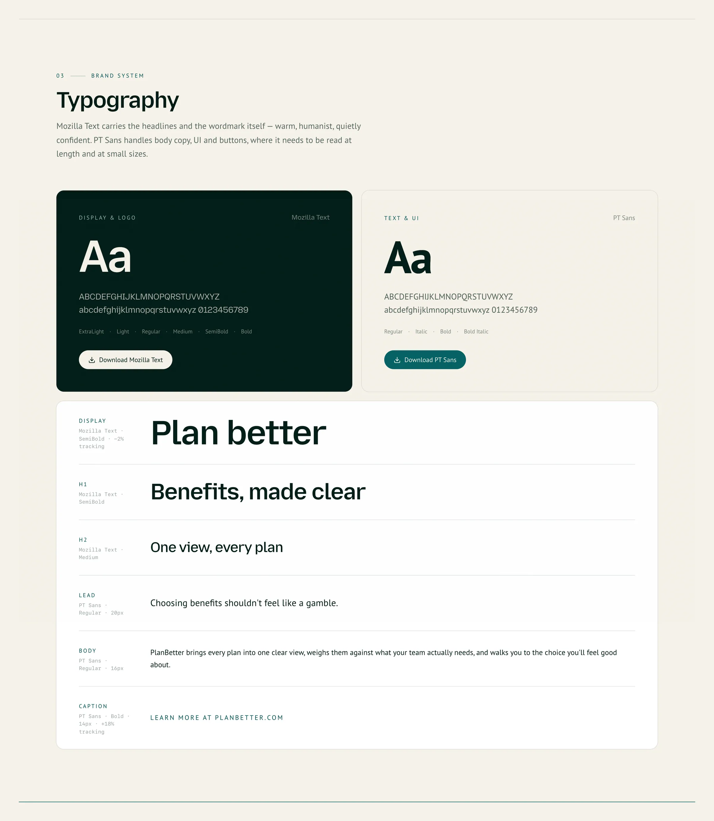
Calm and plainspoken,
on every employer's side.
Choosing benefits shouldn't feel like a gamble.
Name the worry people already feel.
Unlock the power of next-gen benefits optimization.
No hype and no empty verbs.
The choice you'll feel good about long after open enrollment ends.
End on relief, not features.
Headlines with warmth.
Fine print people actually read.
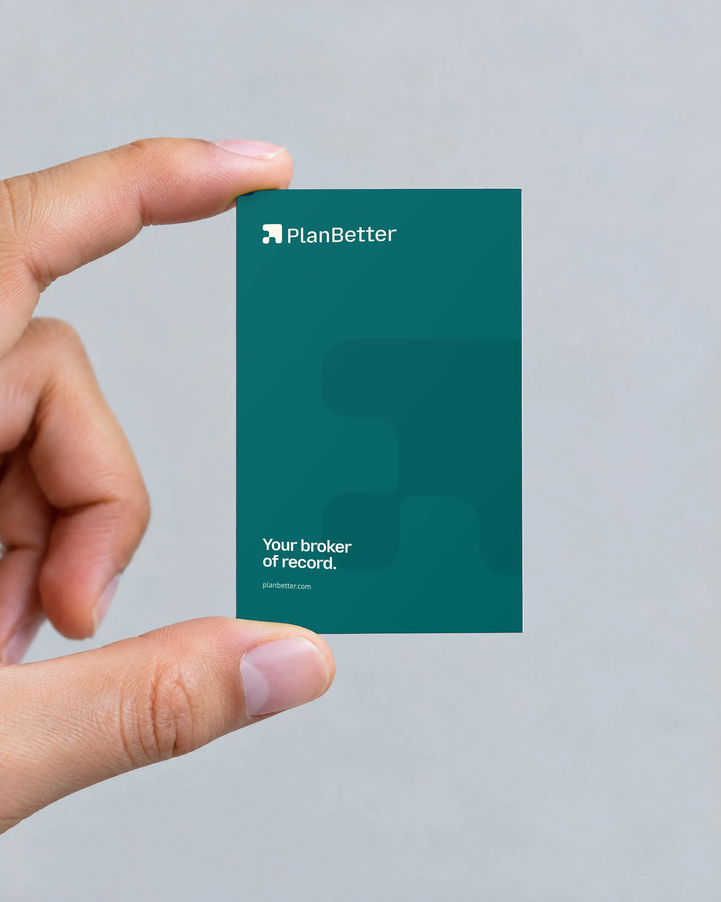
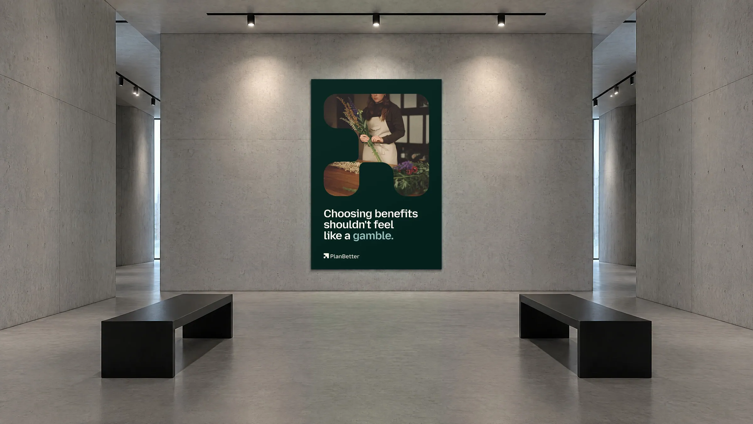
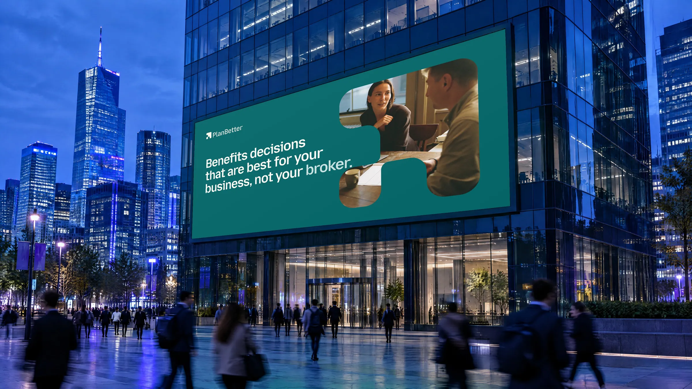
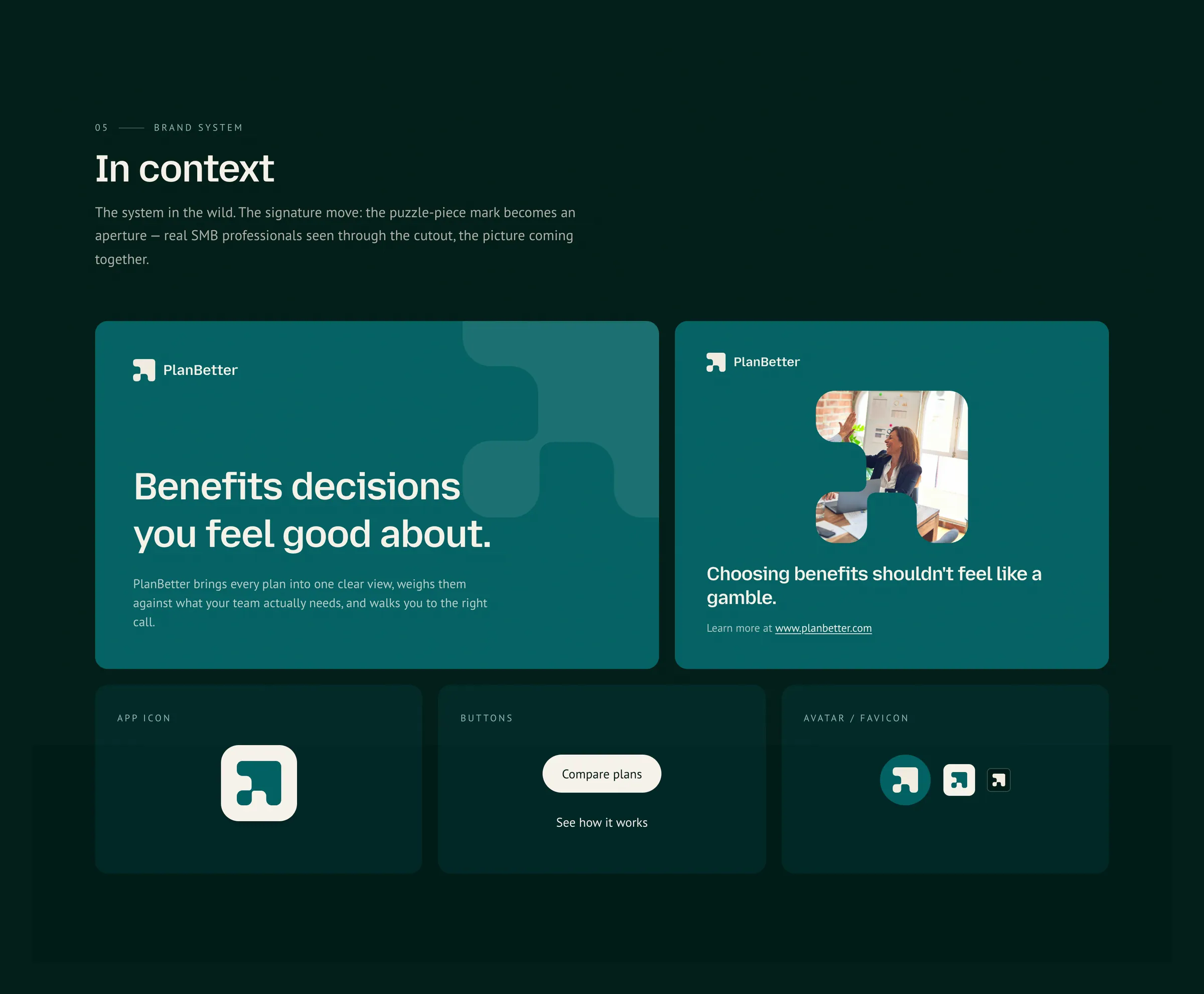
From app icon to button, it always feels like PlanBetter.
Website
A site that makes benefits finally make sense, with PlanCompare at the centre.

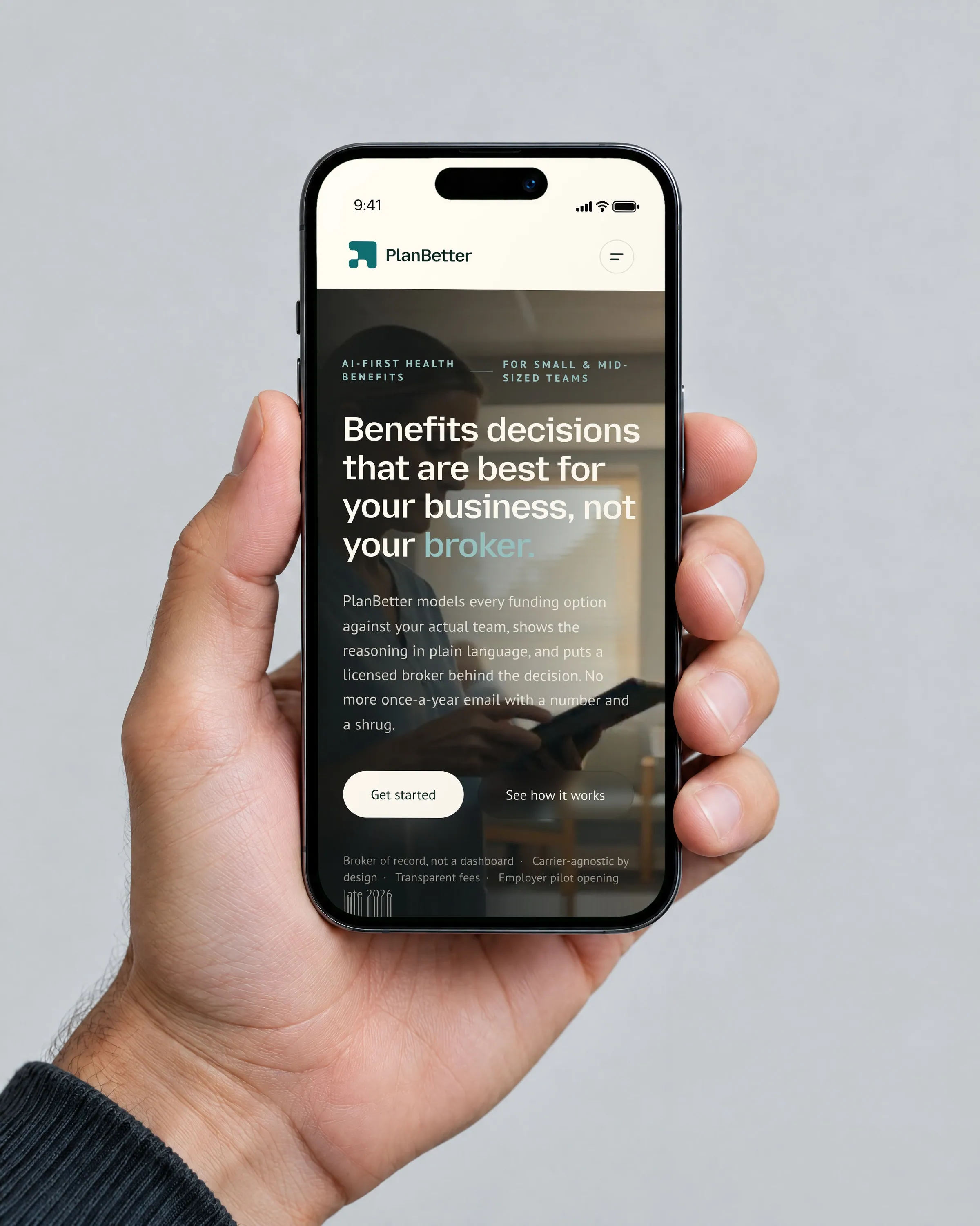
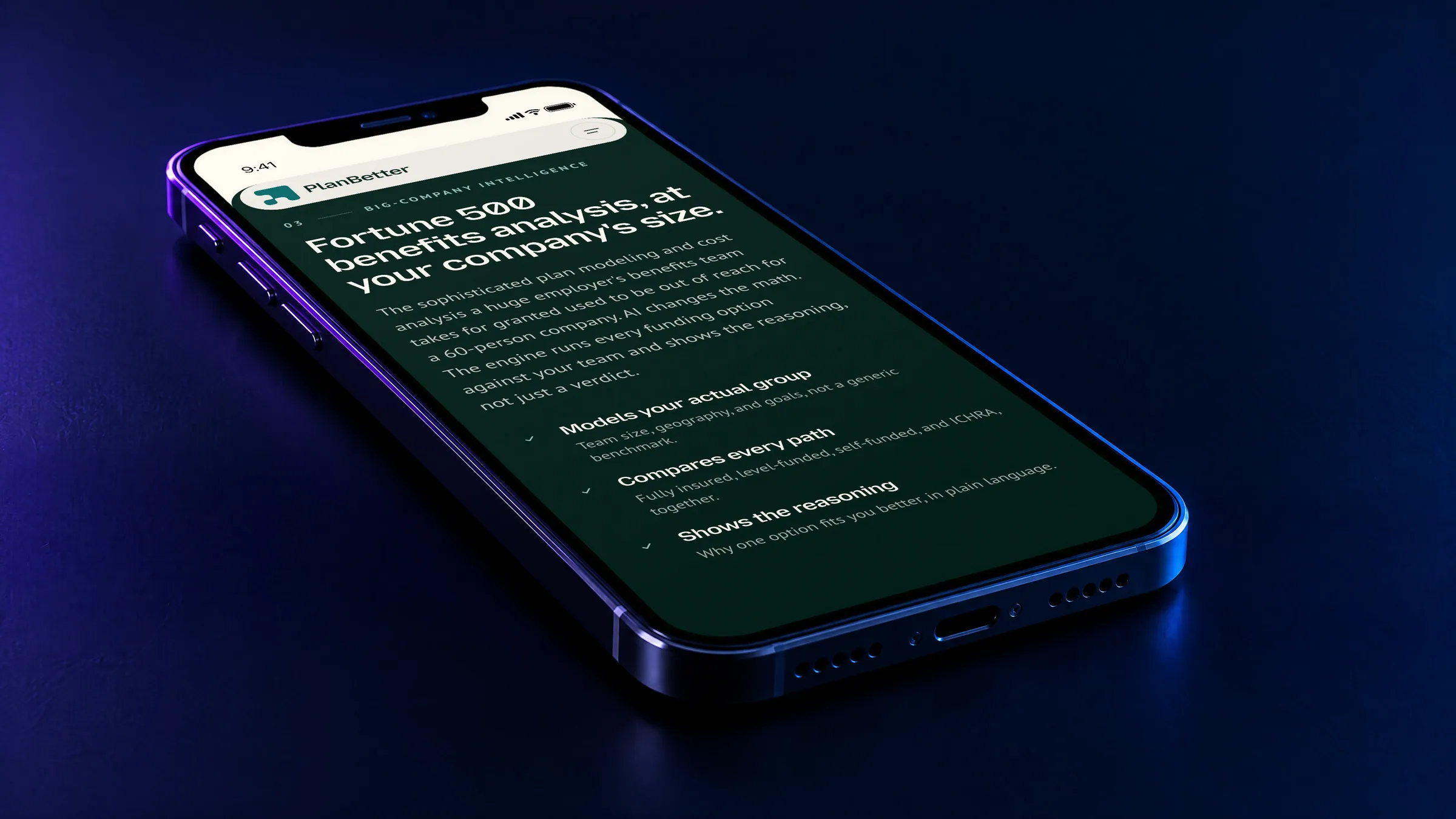
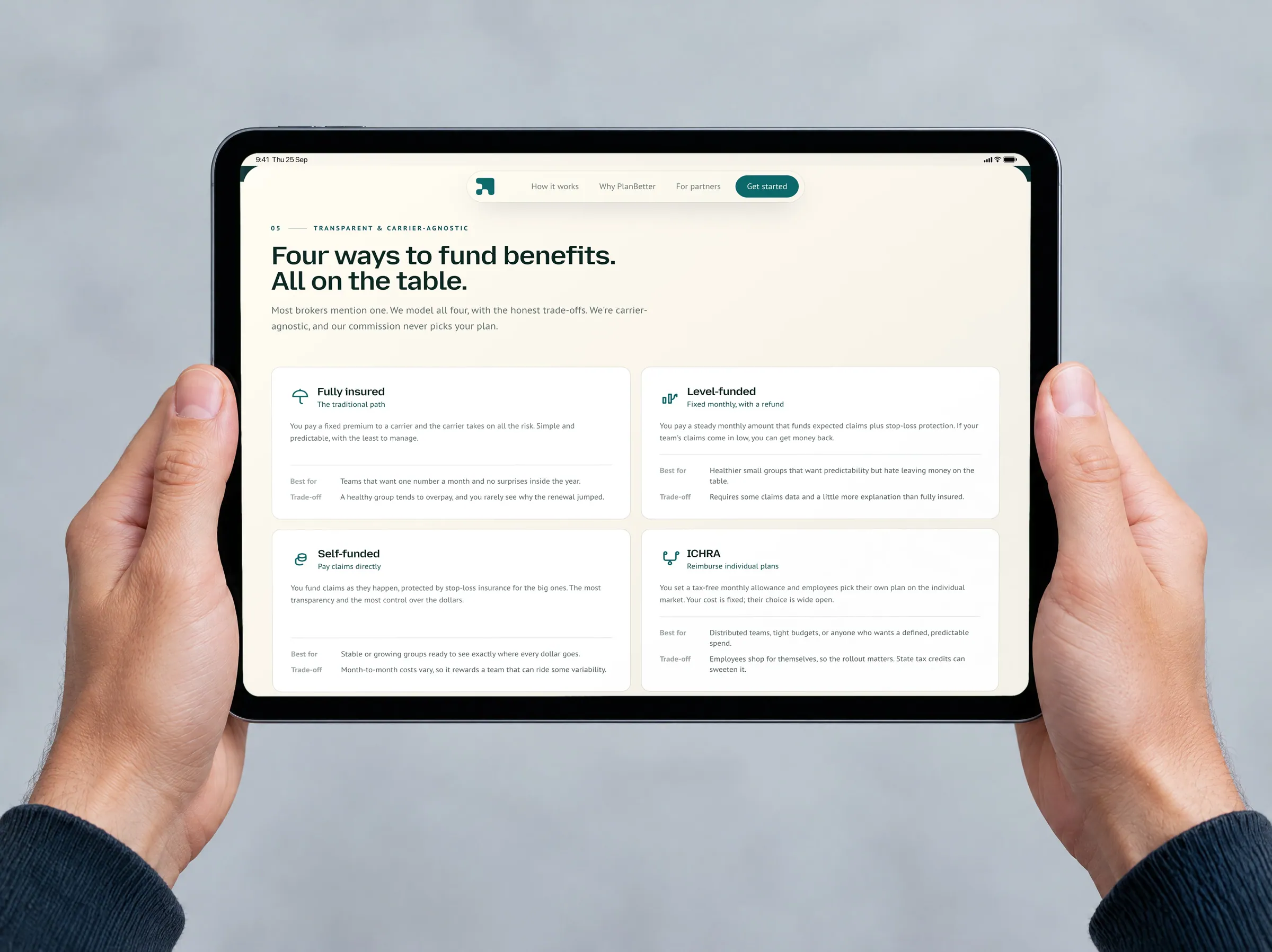
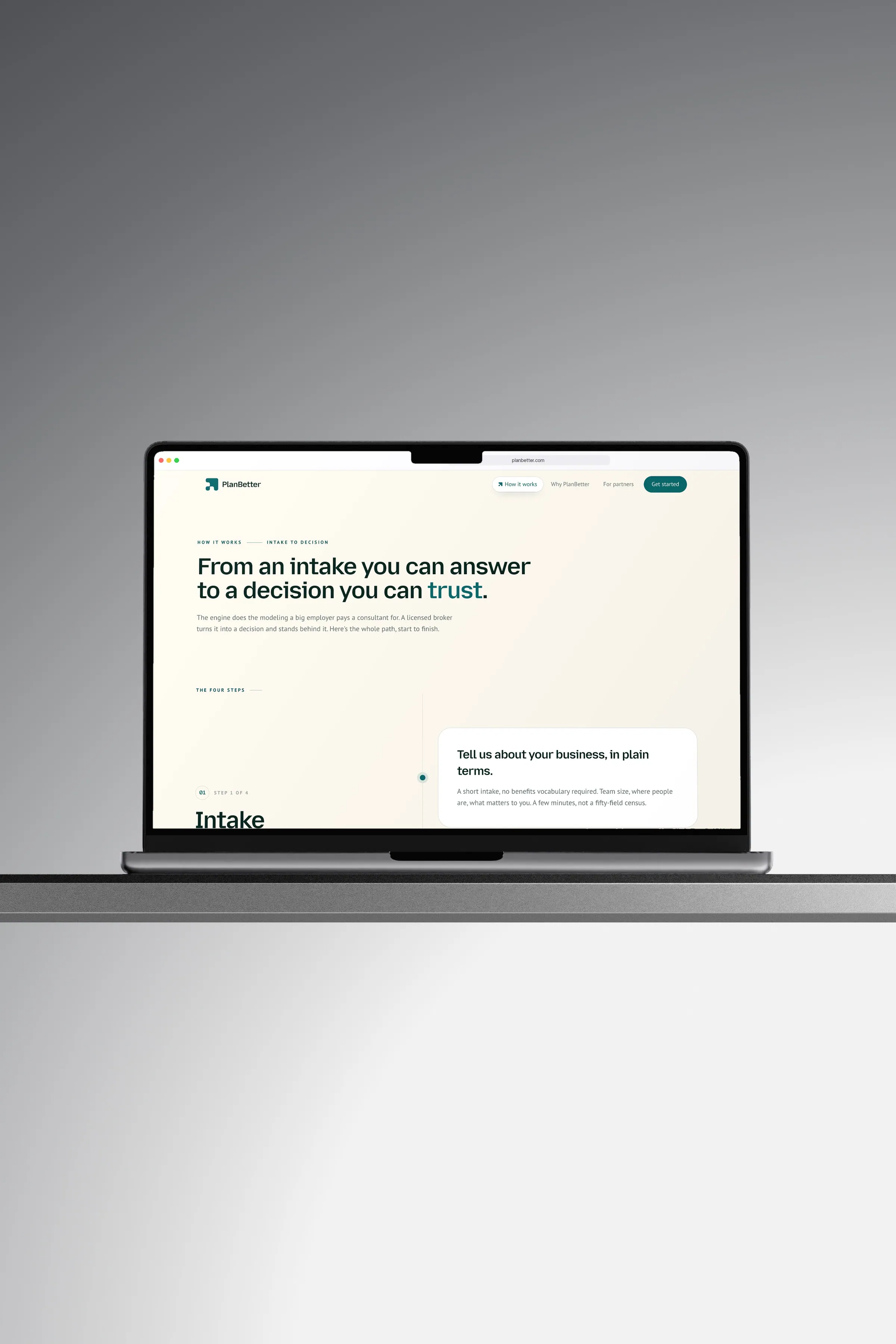
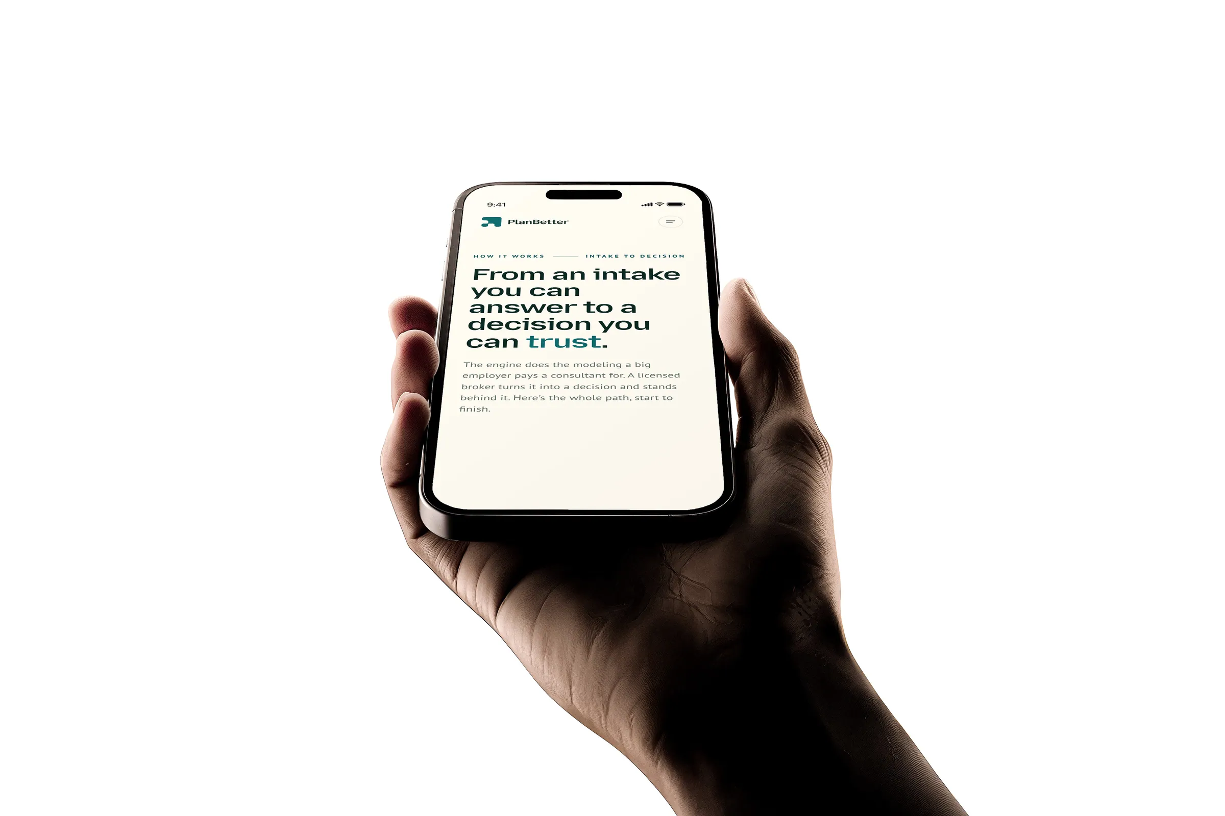
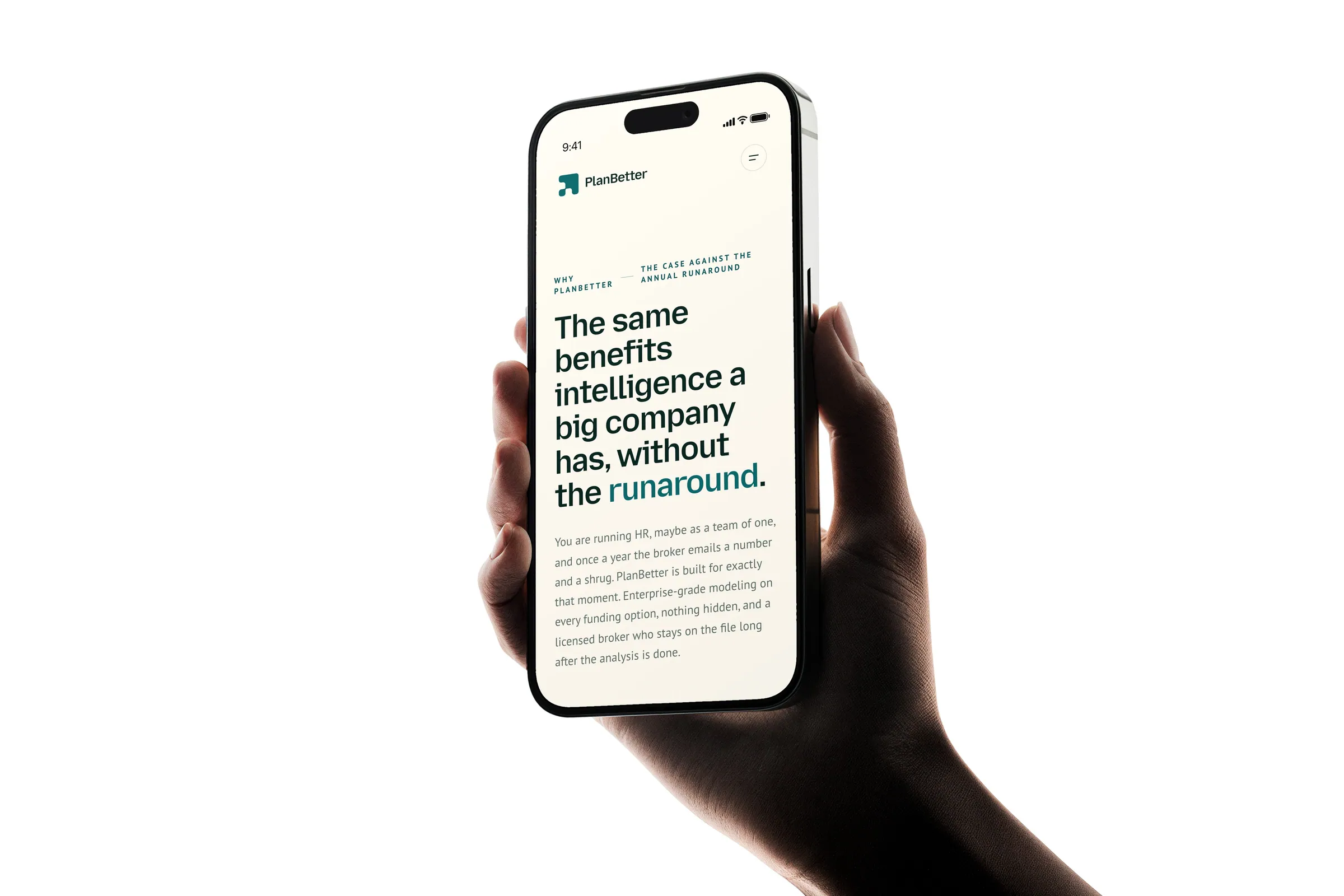
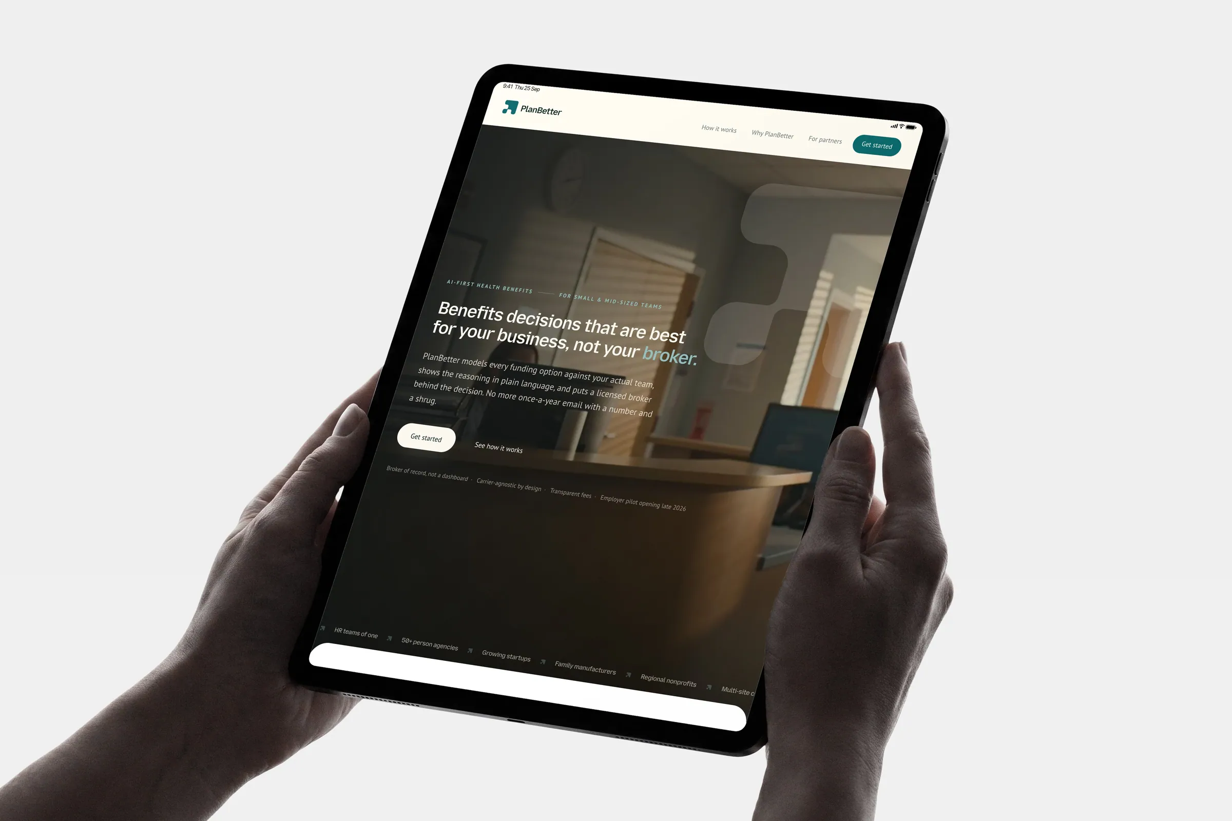
Until the first words appear on a laptop.
Google's search check, ready to be found.
The whole brand, instantly recognisable.
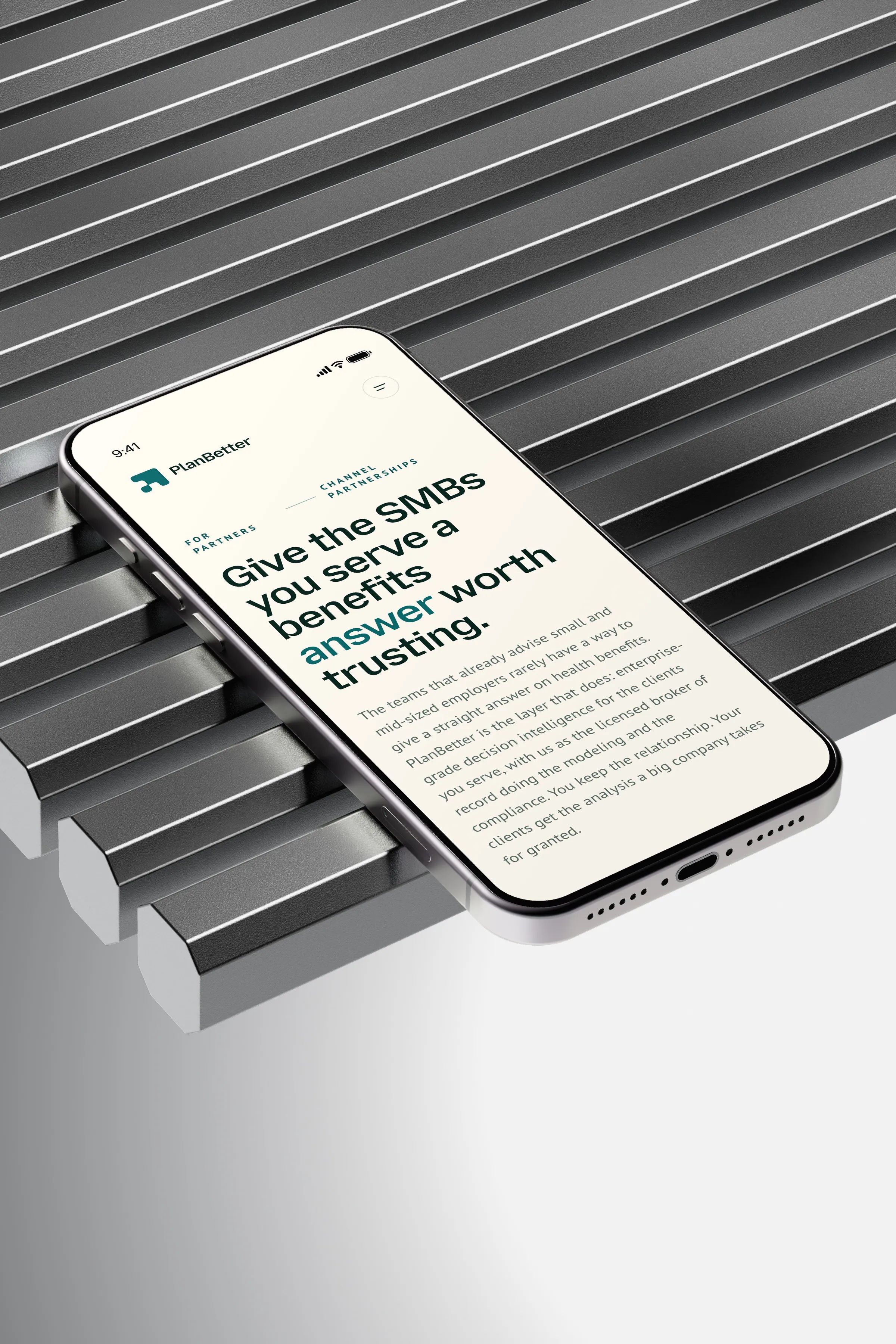
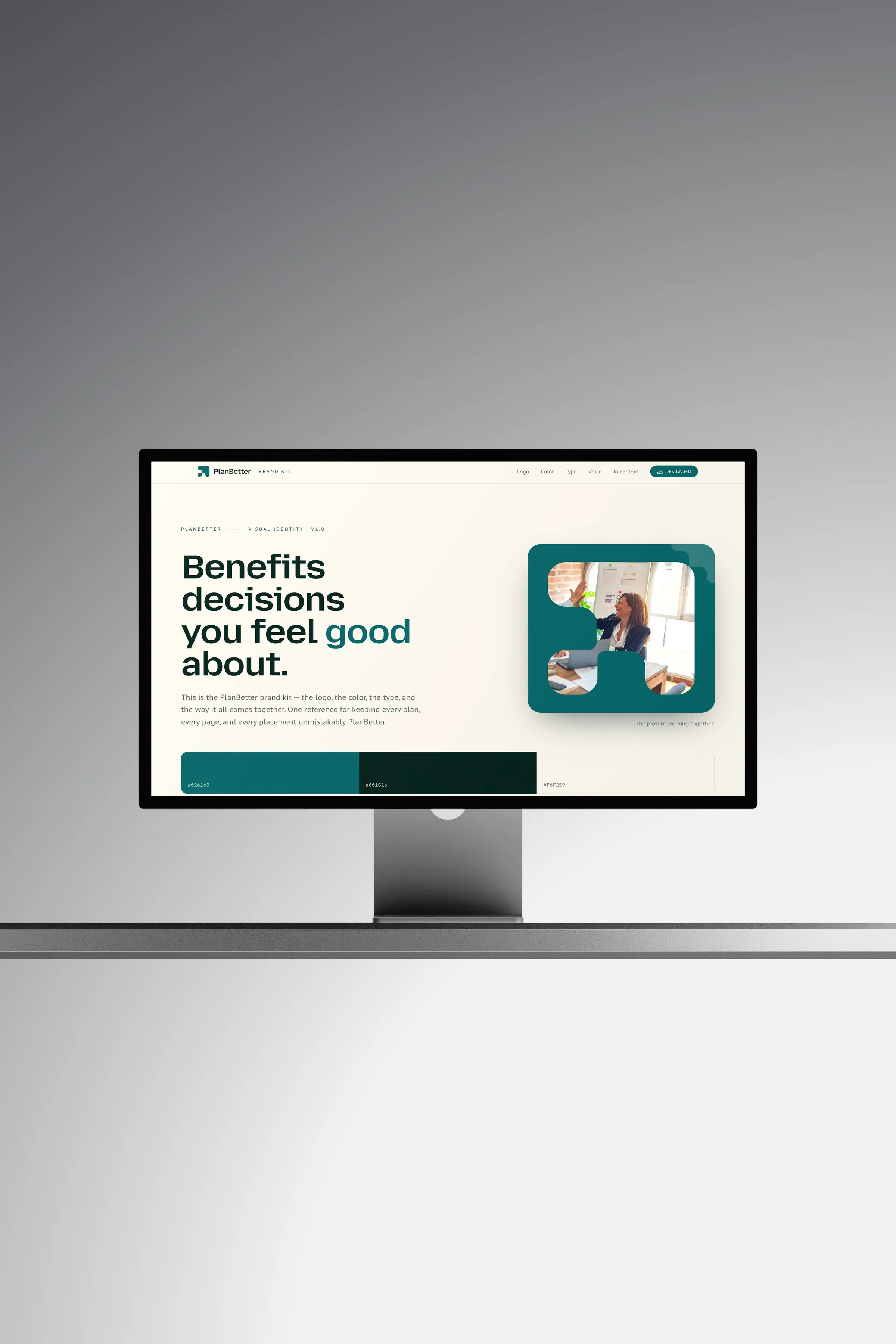
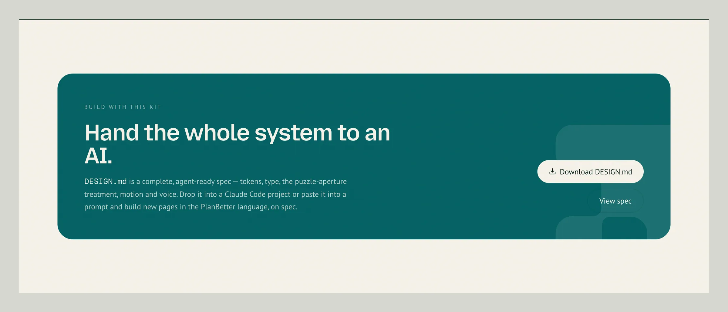
The brand ships with its own build spec, so every new page stays on-brand.
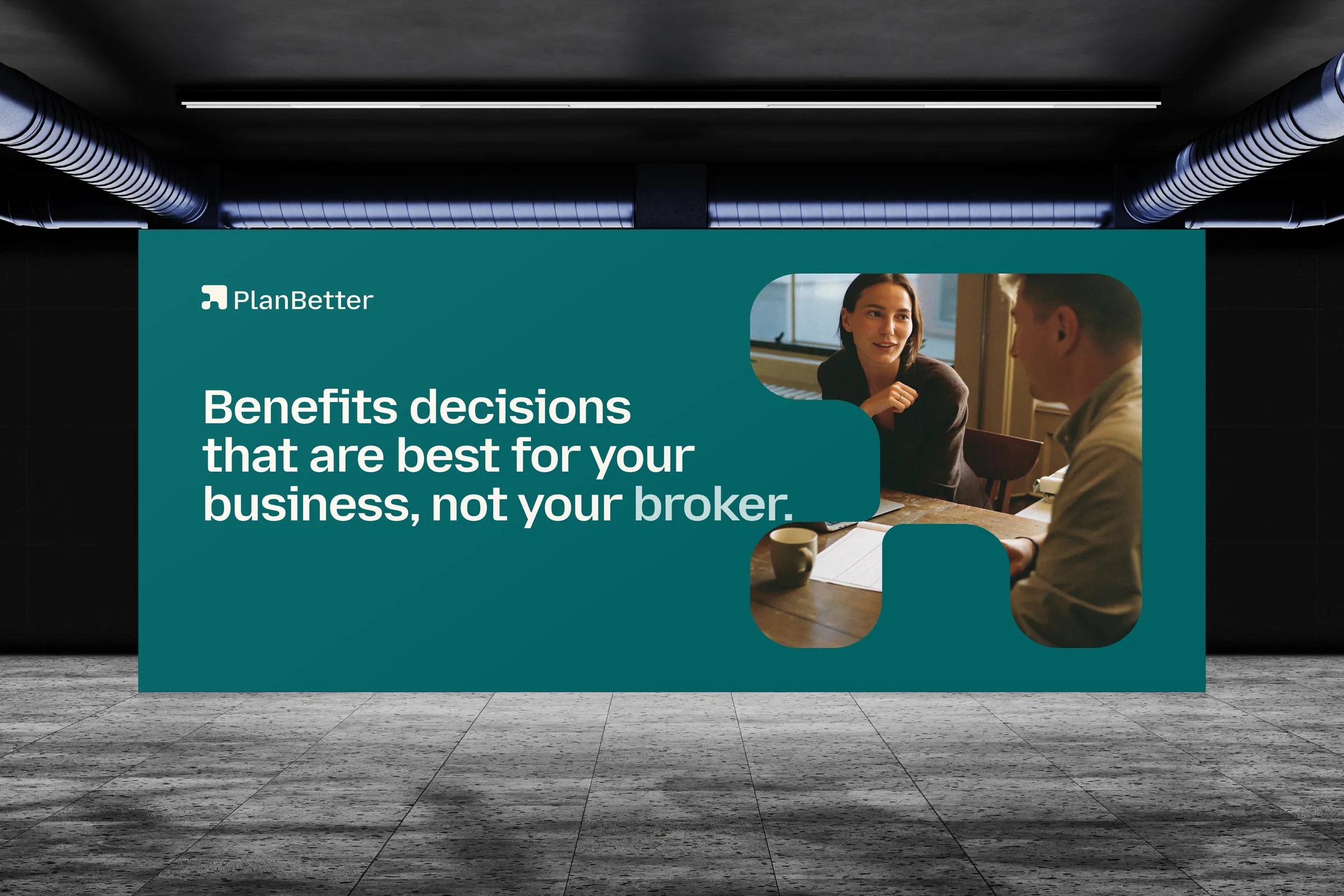

A brand and website that make
benefits feel good again.
Device, print and environment scenes are composited mockups built around real captures of the site. Speed and quality scores measured with Google Lighthouse, September 2026.

